Click on the images to enlarge them.
Next workshop: Advanced Studio Lighting, Tuesday, September 22nd, 7-10 p.m., at my studio in Edina.
Sign up here:
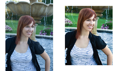
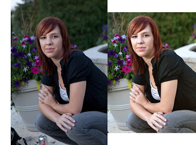
This first image incorporates several devices I often use when I post process portraits. The image on the left is right out of the camera. It's not too bad; properly balanced from an exposure standpoint incorporating flash to help balance the exposure between the foreground and background.
The first thing I do, in Adobe Lightroom, is to crop the image to an 8x10 format. I prefer this format because it's the most commonly printed size and somehow separates a professionally produced image from a snapshot (normally shot in a 35mm format that converts to 4x6).
Next, I process the image out of Lightroom as a Tif to give me some more latitude in dealing with the full spectrum of colors. This becomes important in the next steps. I process the image through a Photoshop plug-in called Nik Color Efex 3.0. I choose a preset called "Pro Contrast." This has the effect of not only brightening the image but providing more contrast. Next, I run the image through another software plug-in called OnOne PhotoTools. In PhotoTools, I choose a preset called SkinSmoother that softens the complexion without touching the rest of the image. Finally, I use the Healing Brush tool in Photoshop to address a few blemishes.
In this next image, I've applied a 1:1 cropping ratio in Lightroom to form a square image. Square portraits as well as square landscapes and florals are becoming more popular. I think the square format works well here because it brings you closer to Emily's face. Notice how textured her skin is in the original image. This is more a function of the camera and its optics than Emily's complexion. Again, the SkinSmoother preset along with the Healing Brush tool cleans up her skin nicely but doesn't overdo it to the point that her skin looks unnaturally porcelain.
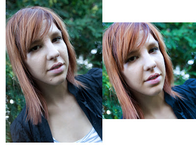
Notice how cropping in this final image takes care of the obvious issue of removing the Coke can and Emily's handbag. In addition, I used the Clarity and Vibrance sliders in Lightroom to bump up the total image quality (non-destructively) before applying the other presets described earlier in Photoshop.
I was able to enhance the brightness of Emily's eyes and teeth using a Contrast Only preset in Color Efex Pro 3.0.


For more information,
4445 W. 77th St. #130
Edina, MN 55435
952-844-0119 c952-905-1197
steve@stevesilvermanimaging.com

No comments:
Post a Comment