I'm lumping the following 8 images together because they seem to have the same problem. What is the point? You need to choose something and create a composition around that. Don't just shoot the technique itself. If the subject content doesn't "change the world" as you may recall from one of the essays, then "pass-a-dena." Here are a few brief comments:
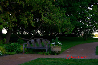
The bench and flower pot are just not that compelling in the context of this scene. Perhaps if it was considerably brighter. I suppose if Monet had painted it, it would have become a masterpiece...or not. It just doesn't sing. Technically, it is a Fibonacci.
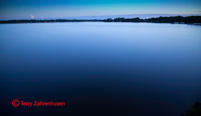
I have a love/hate thing going with this image. It has a huge impact when you first see it. Upon a closer look, it just seems to fall apart. It's all about the color...perhaps that's the Center of Interest. Otherwise, the horizon is slightly out of focus or blurry which would prevent this from being a good enlargement.
Nice...but, so what?
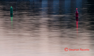
I guess the buoys are the Center of Interest with some sort of horizontal line/contrast thing going on. The buoys are blurry.

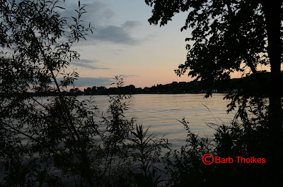
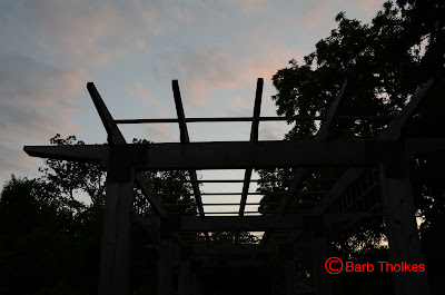
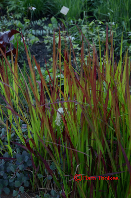
Tom Alvarez. Technique: S Curves
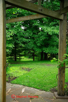
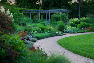
This is a pleasant image. Indeed, there is one prominent S Curve evident. Beyond that, I'm not sure what's going on here. There is not a clearly identifiable Center of Interest. The image is pretty monotone (all that green) with not enough highlights of other colors. I'm also not nuts about shooting this image at f/5.6 with the out of focus foreground.
To improve this image, choose a Center of Interest. This could be anything from the red or white foliage on the left to the pergola in the background. Whatever you choose might involve another compositional technique other than S Curves but it also might be a stronger image.

You used a brush in Aperture to add saturation. I'm not sure that was necessary. The image is a little dark. If you look at the histogram, it's pretty pushed to the left which means it's already saturated. I did a couple of things. The horizon looked crooked to me even if it wasn't. I straightened it in CS5 to make the pergola straight and recropped. The recropping got rid of some of the foreground stuff. I selectively used a lighten brush in OnOne PhotoTools and lightened some of the foliage to give it some more highlights. I also used a Landscape Wow tool in OnOne PhotoTools to darken the background trees and sky so as to make the pergola pop a bit more. I lightened the whole image in CS5 Levels to bring the histogram totally into some level of exposure.
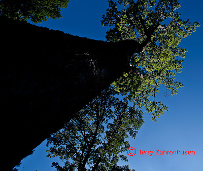
Terry Zahrenhusen. Technique: Converging Lines, Contrast
This is a darn near perfect illustration of Converging Lines and a thoughtful and well executed composition. I don't have to draw the converging lines...they are obvious. The borders of the tree trunk, in silhouette, draw our eyes to the Center of Interest, the crown of this magnificent tree. Slightly underexposed for increased saturation and nicely cropped to about an 8x10 ratio. This is a display worthy image. One note: you have some spots on your sensor. Consider getting it cleaned and be sure to dust off the front and back of your lens.
For more information,
4445 W. 77th St. #130
Edina, MN 55435
952-844-0119 c952-905-1197

No comments:
Post a Comment